Use teaser to add a teaser, big box for calling extra attention to some special content or information. You can show an image or optional icon as well as the title, optional secondary title and body text in larger than usual fonts.
For real examples of teaser and possible options go to our teaser Demo Page
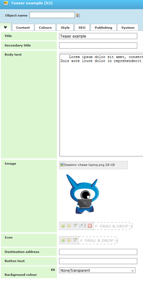
Here are the most useful properties for Teaser component that are placed in EasyTab:
- Title - defines the title of teaser
- Secondary title – subtitle of teaser
- Body text – short description for the teaser
- Image – image that will be shown on the teaser
- Icon – Icon that can be shown for the teaser
- Destination address –it will create button with link to internal or external page based on the entered link or page ID. If empty there will be no button on the teaser
- Button text – text for the destination address button.
- Background color – background of the teaser
Please note that all of the properties are optional.
There are many more properties for Teaser component. You can check them for yourself and decide which of them to use.