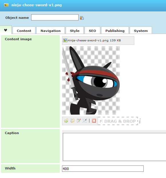
The image component allows you to add an image and set some additional options. You can also create image links, add mouse over effects and link to a large image. Normally you will only need to upload or choose the image. In order to make the image available for users with a disability or search engines it is a good idea also to define alternative text, found on the SEO tab. All other properties are optional and will function if left with their default settings.
Let’s focus again on the most useful properties placed in EasyTab.
- Content Image – this is the image that will be used. There are different options from the buttons. You can upload an image temporary, browse and choose an image, edit the file URL or remove it. Browse button will open the File Manager from where you can choose an image or upload such one if you didn’t do that already. You can also upload local images with “Upload” button but they will be temporary – only for the current Image component and there will be no possibility to be used for other Image components. For direct upload there is also an option to Drag and Drop the image in the corresponding area.
- Caption – it is shown below the image
- Width – maximum width of the image
There are also other available properties for Image component like title, image alt text, large and mouse over image, showing the image based on device resolution, link for use when clicking the image and many more.
You can check the real examples with images and possible options on our images Demo Page