Text component is responsible for the text content. With Text component you can add heading, text content and image at once on your page. We will focus again on the most useful properties that are placed in EasyTab.
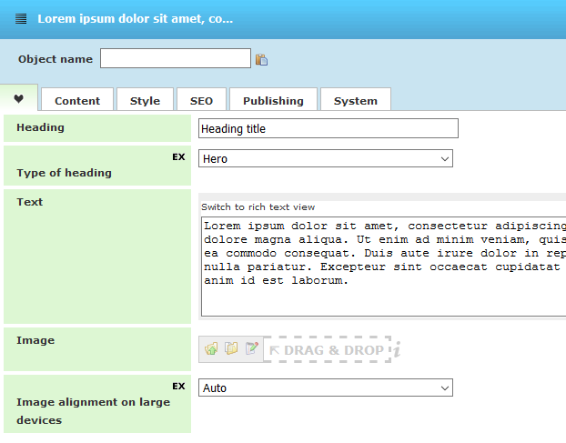
- Heading - defines header title that will appear at the start of the Text object. It is not necessary to use it if you want to just have a text content or you already used the Heading
- Type of heading – this one is for the size of the header if such one is used and it is decreasing from Hero to Minor. For more details about Type of heading property go to Heading component
- Text – this is the main property of text component. You can enter the content here. By default it’s in plain text but you can switch to Rich Text Editor mode and add images or format the text.
- Image – you have the possibility to add Image in Text component. Image, where you choose an Image, which can be formatted on the Style tab.
- Image alignment on large devices – how the image will be aligned on large devices such as desktops. Possible options are Auto (default), Left, Center, Right
Please note that all of the properties are optional.
There are also other properties in Content, Style and SEO tabs. They are responsible for the styling of images and text or the SEO – defining the header tag and the image alt text.
You can check the real examples with text objects on our Demo Page